OneActionBar Instructions for use
Introduction
*Custom ActionBar, support attribute, java code mode configuration, can realize title, title with return key, search, search ActionBar with return key; simple configuration, convenient to use, can adapt to most scenes. *
renderings
###
- Standard header, transparent background
style="@style/OneActionBar.Normal" - Standard heading, blue background
style="@style/OneActionBar.Normal.Blue" - With return key header, transparent background
style="@style/OneActionBar.Back" - With the return key head, blue background
style="@style/OneActionBar.Back.Blue" - With search box header, transparent background
style="@style/OneActionBar.Search" - With search box header, blue background ``style=”@style/OneActionBar.Search.Blue”
- Search box with return key header, transparent background
style="@style/OneActionBar.Back.Search" - Search box with return key header, blue background
style="@style/OneActionBar.Back.Search.Blue"
Introduction method
TAG: 
gradle
- Add the following configuration to build.gradle (same level as model) in the root directory of the project
Allprojects {
Repositories {
...
Maven { url 'https://jitpack.io' }
}
}
- Add dependencies in build.gradle in model
Dependencies {
Implementation 'com.github.onestravel:OneActionBar:TAG'
}
Attribute Description
| Property Name | Field Description | Example |
|---|---|---|
| app:barBackColor | ActionBar Returns the color of the key, the color of the icon and the font | app:barBackColor=”#000000” |
| app:barBackIconWidth | ActionBar Returns the width of the key icon | app:barBackIconWidth=”25dp” |
| app:barBackIconHeight | ActionBar Returns the height of the key icon | app:barBackIconHeight=”25dp” |
| app:barBackText | ActionBar back key text | app:barBackText=”return” |
| app:barBackTextSize | ActionBar back key text size | app:barBackTextSize=”13sp” |
| app:barTitle | ActionBar Headline Text | app:barTitle=”Home” |
| app:barTitleColor | ActionBar Header Text Color | app:barTitleColor=”#000000” |
| app:barTitleSize | ActionBar Header Text Size | app:barTitleSize=”22sp” |
| app:barType | ActionBar style, there are four styles in total: TYPE_NORMAL (normal style), TYPE_BACK (normal with return key style), TYPE_SEARCH (search style), TYPE_BACK_SEARCH (with return key search style), | app:barType=” TYPE_NORMAL” |
| app:barActionBtnColor | ActionBar Right side action button icon/text color | app:barActionBtnColor=”#FF0000” |
| app:barActionBtnText | ActionBar Right side action button text | app:barActionBtnText=”Next” |
| app:barActionBtnTextSize | ActionBar title action button text size | app:barActionBtnTextSize=”15sp” |
| app:barBottomLineWidth | The width of the split line at the bottom of the ActionBar | app:barBottomLineWidth=”1dp” |
| app:barBottomLineColor | The color of the bottom line of the ActionBar | app:barBottomLineColor=”#1a1a1a” |
| app:barActionBtnIcon | ActionBar Right side action button icon | app:barActionBtnIcon=”@drawable/icon_next” |
| app:barActionBtnIconWidth | ActionBar Title Action Button Width | app:barActionBtnIconWidth=”25dp” |
| app:barActionBtnIconHeight | ActionBar The right side of the action button height | app:barActionBtnIconHeight=”25dp” |
| app:barSearchBackground | ActionBar Search Style Background | app:barSearchBackground=”#FFFFFF” |
| app:barSearchHint | ActionBar search style search box hint text | app:barSearchHint=”Please enter search content” |
| app:barSearchText | ActionBar Search Style Search Box Text | app:barSearchText=”Today News” |
| app:barSearchHintColor | ActionBar Search Style Search Box Tip Text Color | app:barSearchHintColor=”#E1E1E1” |
| app:barSearchTextColor | ActionBar Search Style Search Box Text Color | app:barSearchTextColor=”#000000” |
| app:barSearchTextSize | ActionBar Search Style Search Box Text Size | app:barSearchTextSize=”20sp” |
| android:background | ActionBar background color | android:background=”#FFFFFF” |
Style Description
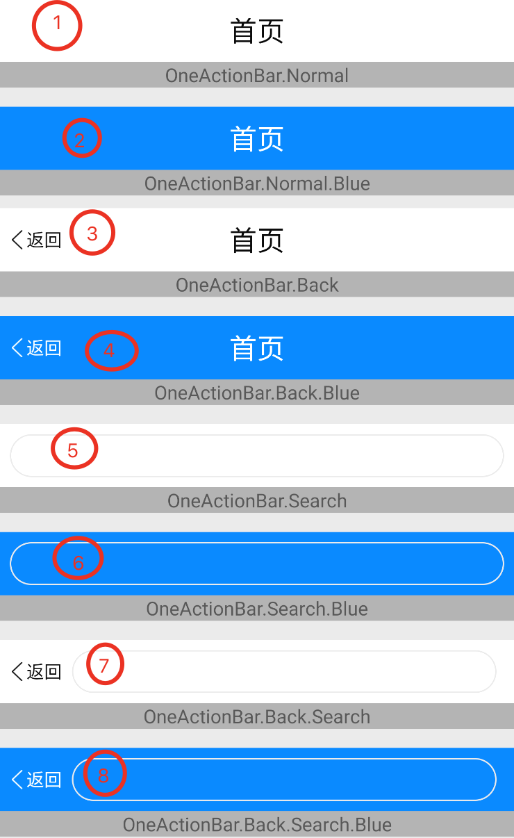
According to the image effect, the first custom style description is as follows
Note: The label corresponds to the picture effect number
- Standard header, transparent background
style="@style/OneActionBar.Normal" - Standard heading, blue background
style="@style/OneActionBar.Normal.Blue" - With return key header, transparent background
style="@style/OneActionBar.Back" - With the return key head, blue background
style="@style/OneActionBar.Back.Blue" - With search box header, transparent background
style="@style/OneActionBar.Search" - With search box header, blue background ``style=”@style/OneActionBar.Search.Blue”
- Search box with return key header, transparent background
style="@style/OneActionBar.Back.Search" - Search box with return key header, blue background
style="@style/OneActionBar.Back.Search.Blue"
example
- layout xml
<cn.onestravel.one.actionbar.OneActionBar
        Style="@style/OneActionBar.Back.Blue"
        Android:layout_width="match_parent"
        Android:layout_height="50dp"
        App:barActionBtnText="Next"
App:barTitle="Questionnaire" />- style
<style name="OneActionBar.Back">
               <item name="barTitleSize">22sp</item>
        <item name="barActionBtnTextSize">16sp</item>
        <item name="barType">TYPE_BACK</item>
        <item name="barBackTextSize">14sp</item>
        <item name="barBackText">Back</item>
</style>

<style name="OneActionBar.Back.Blue" parent="OneActionBar.Back">
    <item name="android:background">#0080ff</item>
    <item name="barBackColor">@android:color/white</item>
    <item name="barTitleColor">@android:color/white</item>
    <item name="barActionBtnColor">@android:color/white</item>
</style>